Labels are a last resort
Adapted from our book and video series, Refactoring UI.
Put down the accessibility pitchfork — this isn't about forms.
When presenting data to the user (especially data from the database), it's easy to fall into the trap of displaying it using a naive label: value format.

The problem with this approach is that it makes it difficult to present the data with any sort of hierarchy; every piece of data is given equal emphasis.
You might not need a label at all
In a lot of situations, you can tell what a piece of data is just by looking at the format.
For example, [email protected] is an email address, (555) 765-4321 is a phone number and $19.99 is a price.
When the format isn't enough, the context often is. When you see the phrase "Customer Support" listed below someone's name in an employee directory, you don't need a label to make the connection that that is the department the person works in.

When you're able to present data without labels, it's much easier to emphasize important or identifying information, making the interface easier to use while at the same time making it feel more "designed".
Combine labels and values
Even when a piece of data isn't completely clear without a label, you can often avoid adding a label by adding clarifying text to the value.
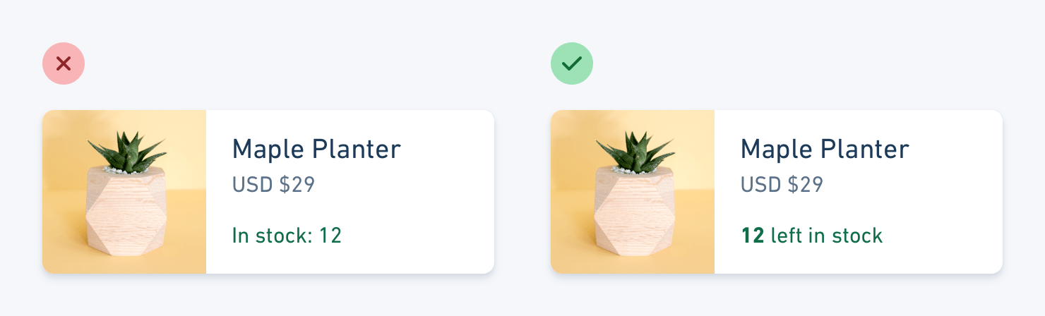
For example, if you need to display inventory in an e-commerce interface, instead of "In stock: 12", try something like "12 left in stock".
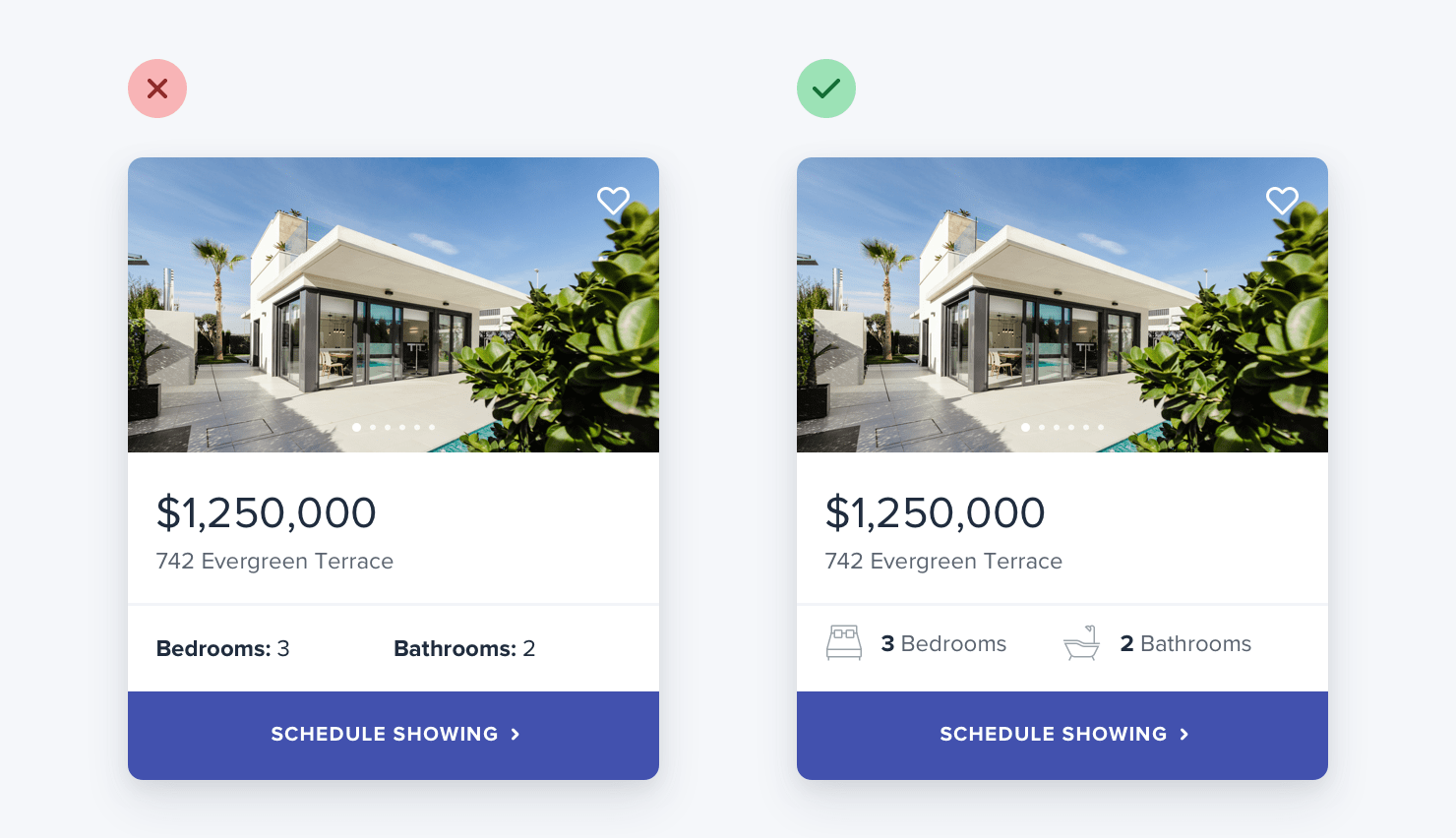
If you're building a real estate app, something like "Bedrooms: 3" could simply become "3 bedrooms".
When you're able to combine labels and values into a single unit, it's much easier to give each piece of data meaningful styling without sacrificing on clarity.
Labels are secondary
Sometimes you really do need a label; for example when you're displaying multiple pieces of similar data and they need to be easily scannable, like on a dashboard.
In these situations, add the label, but treat it as supporting content. The data itself is what matters, the label is just there for clarity.
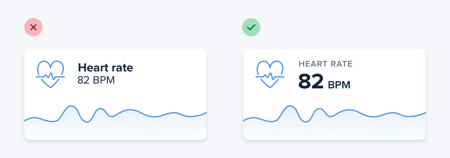
De-emphasize the label by making it smaller, reducing the contrast, using a lighter font weight, or some combination of all three.
When to emphasize a label
If you're designing an interface where you know the user will be looking for the label, it might make sense to the emphasize the label instead of the data.
This is often the case on information-dense pages, like the technical specifications of a product.
If a user is trying to find out what modem is in a laptop, they're probably scanning the page for the words "Modem", "WiFi" or "Wireless", not "Qualcomm" or "Intel".
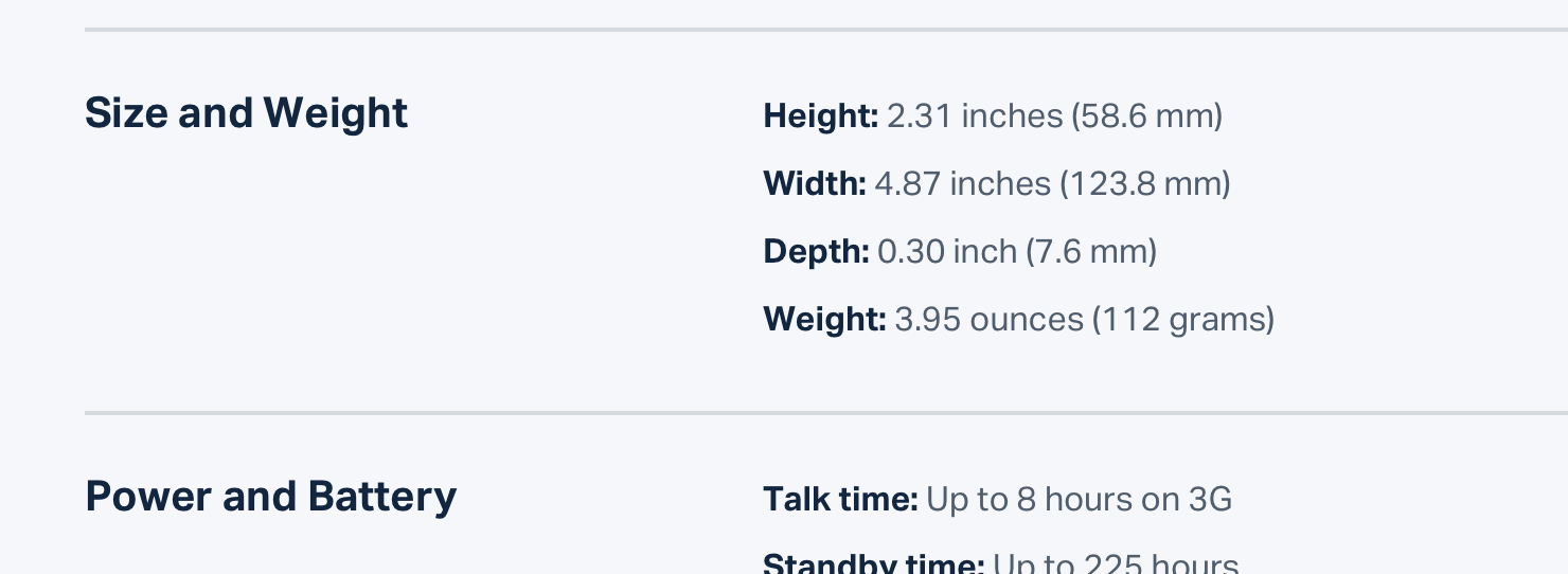
Don't de-emphasize the data too much in these scenarios; it's still important information. Simply using a darker color for the label and a slightly lighter color for the value is often enough.