Make your ideas look awesome, without relying on a designer.
Learn how to design beautiful user interfaces by yourself using specific tactics explained from a developer's point-of-view.
This is the survival kit I wish I had when I was starting out building apps.

Derrick Reimer
Founder of SavvyCal
This book is fantastic for engineers learning how to design.

Alex MacCaw
Founder of Clearbit
This book Refactoring UI is a no-brainer for anyone in the web industry.

Justin Jackson
Co-founder of Transistor
“I know this looks terrible, but I have no idea why.”
Hi! I'm Adam Wathan, a full stack developer who used to suck at design. I've been friends with Steve Schoger for years and we've worked on a bunch of side projects together — him handling the UI design and me taking care of development.
Like a lot of developers, I always wished I could make my ideas look awesome without relying on a designer, but any time I tried to design something myself I would always get frustrated and give up.
I always chalked it up to a left brain/right brain sort of thing — I'm logical and analytical so I'm good at programming, people like Steve are intuitive and creative so he's good at design.
But after working closely with Steve I started picking up little tricks. Tricks that didn't require any artistic talent, but made things look better instantly for reasons that made sense to me as a developer.
Design with tactics, not talent.
Here's a concrete design tactic I bet you see applied every day but haven't explicitly noticed.
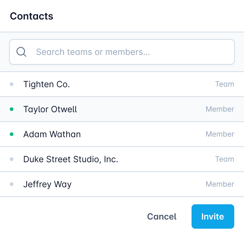
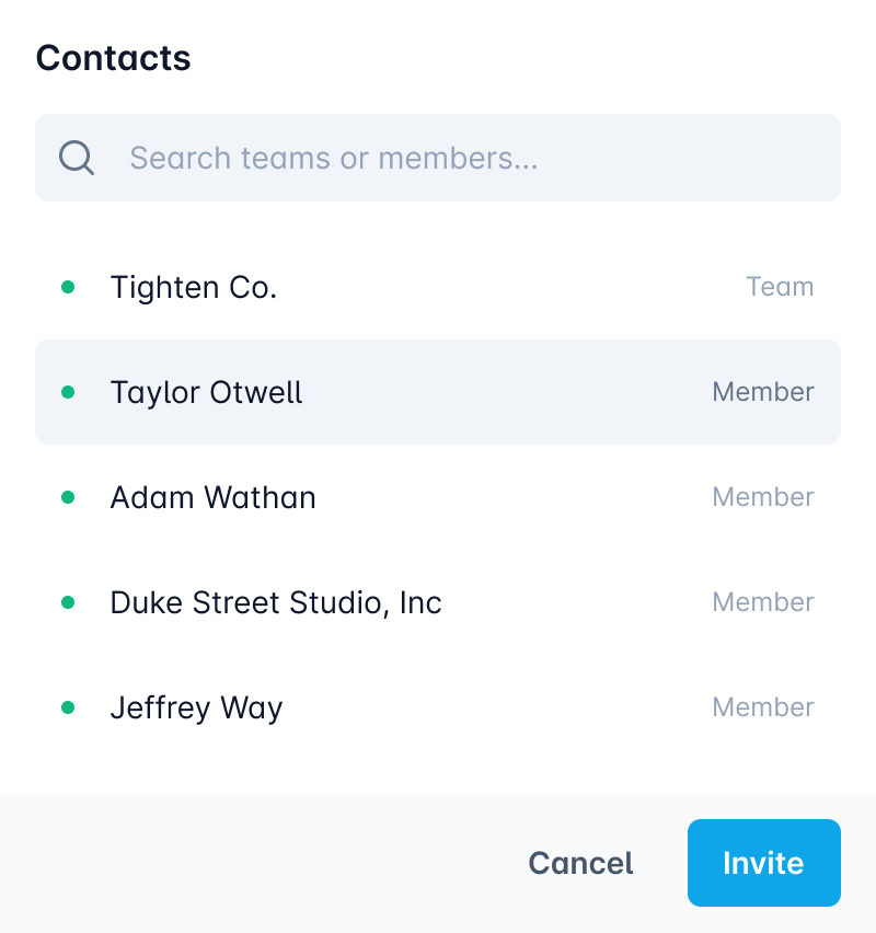
Use fewer borders.
Borders are a great way to distinguish two elements from one another, but using too many of them can make your design feel busy and cluttered.
Instead, try adding a box shadow, using contrasting background colors, or simply adding more space between elements.
It doesn't take any talent to make changes like this — once you know the tactic you just need to notice the problem and apply the solution.
Most design courses are missing the mark.
They focus so much on high level principles like color theory and typography which, while important, never helped me make instant improvements like the actionable, specific tactics I was picking up from Steve.
Working together, we knew we could create something better.
Over the last few years, we've helped thousands of developers get better at design through quick tips, in-depth articles, and video tutorials.
Refactoring UI takes everything we know about design and bundles it into one comprehensive package, including a book, screencasts, a component gallery, custom designed assets, and more.
It’s exactly what I needed when I was struggling to make my projects look awesome.
What we’ve put together
It's not just a book — it's everything you need to start producing better designs today.
When we first started working on this project, our ambitions were pretty modest — take all of the tips and tricks we’ve shared on Twitter, bundle them up into one resource, and put it out into the world.
But the more time we put into planning it, the more we realized that we had an opportunity to create something better than that. Something that wasn’t just a book, but more like a complete survival kit for designing for the web.
Here’s what we ended up with…
The Book
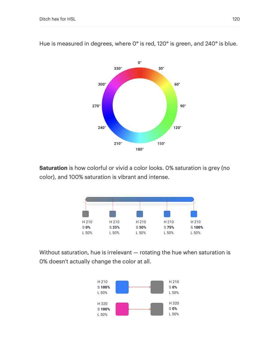
A beautiful PDF containing 50 incredibly visual chapters spread across 200+ painstakingly typeset pages.
This book contains literally everything we know about web design, distilled into short, easy to read chapters.
Every chapter is designed to be as independent as possible, so you can read them in almost any order. And if you want to sit down and read the whole thing at once, you’ll have no trouble getting through it in just a couple of hours.
We hate books that repeat the same ideas over and over just to fill out the page count. This book is written a lot like our blog posts — every sentence is highlight-worthy.
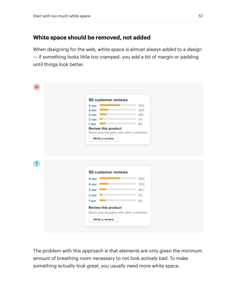
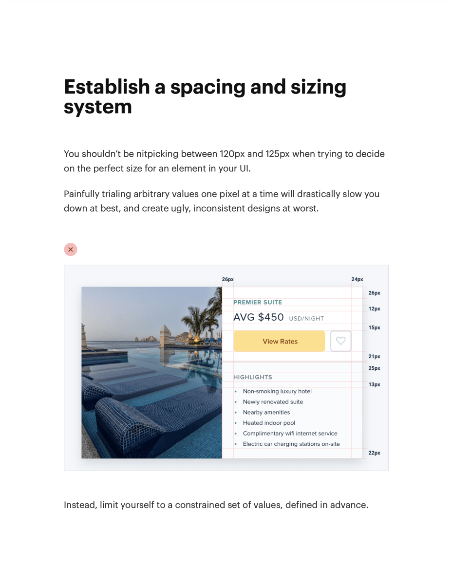
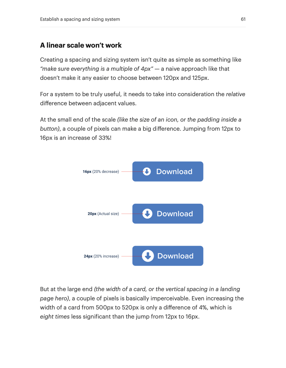
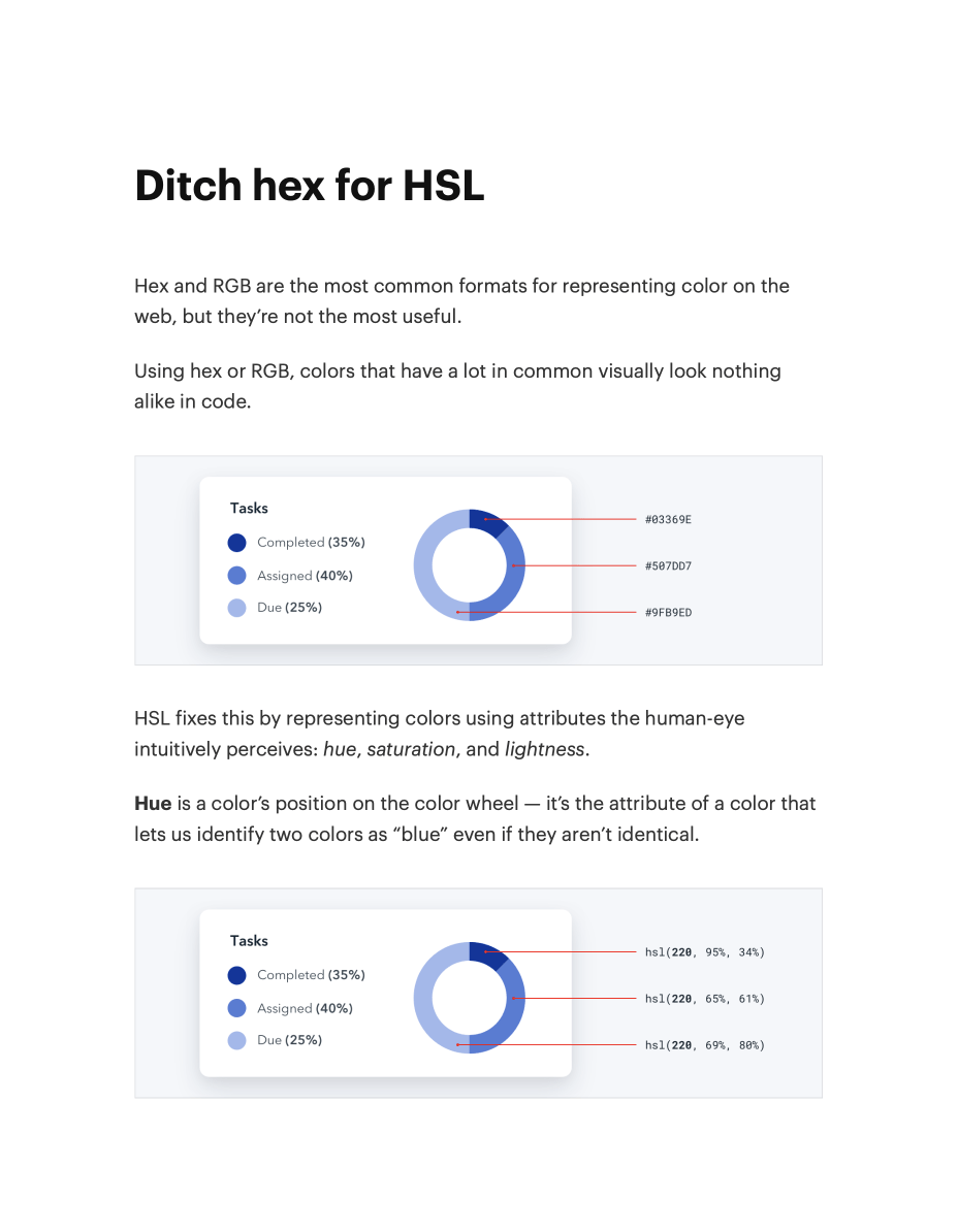

Full table of contents
Starting from Scratch
- Start with a feature, not a layout7
- Detail comes later10
- Don’t design too much13
- Choose a personality17
- Limit your choices24
Hierarchy is Everything
- Not all elements are equal30
- Size isn’t everything32
- Don't use grey text on colored backgrounds36
- De-emphasize to emphasize39
- Labels are a last resort41
- Separate visual hierarchy from document hierarchy46
- Balance weight and contrast48
- Semantics are secondary52
Layout and Spacing
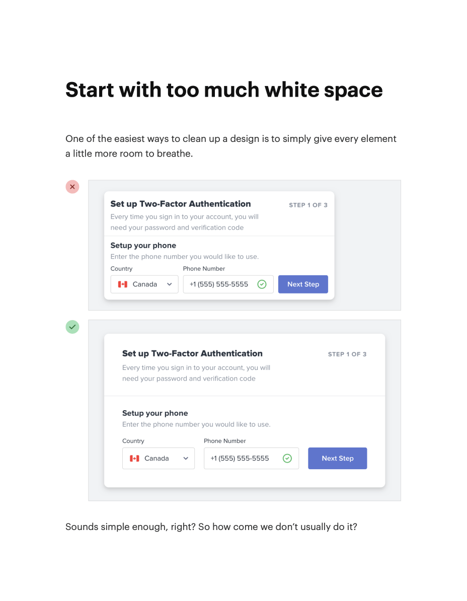
- Start with too much white space56
- Establish a spacing and sizing system60
- You don’t have to fill the whole screen65
- Grids are overrated72
- Relative sizing doesn’t scale79
- Avoid ambiguous spacing83
Designing Text
- Establish a type scale88
- Use good fonts94
- Keep your line length in check99
- Baseline, not center102
- Line-height is proportional105
- Not every link needs a color109
- Align with readability in mind111
- Use letter-spacing effectively115
Working with Color
- Ditch hex for HSL119
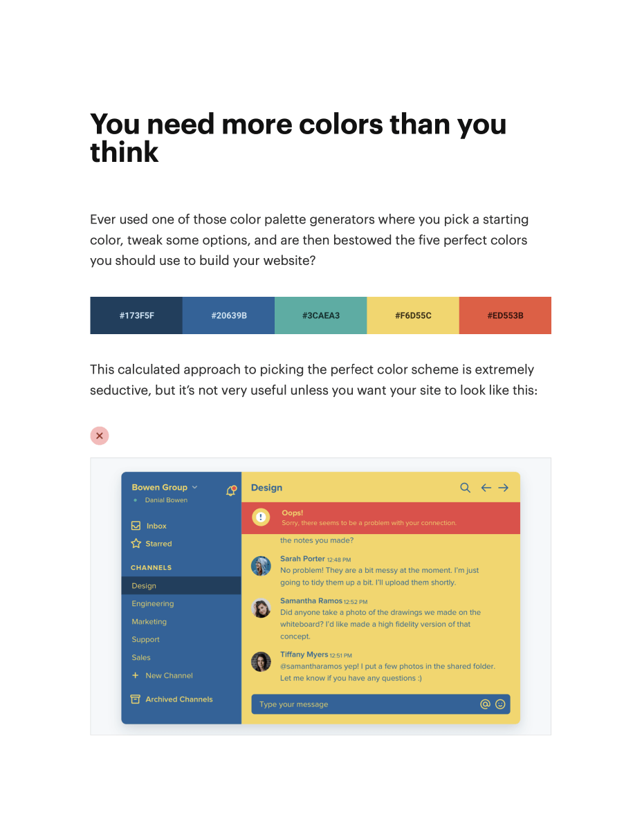
- You need more colors than you think123
- Define your shades up front129
- Don’t let lightness kill your saturation133
- Greys don’t have to be grey139
- Accessible doesn’t have to mean ugly142
- Don’t rely on color alone146
Creating Depth
- Emulate a light source150
- Use shadows to convey elevation158
- Shadows can have two parts163
- Even flat designs can have depth167
- Overlap elements to create layers170
Working with Images
- Use good photos174
- Text needs consistent contrast176
- Everything has an intended size181
- Beware user-uploaded content187
Finishing Touches
- Supercharge the defaults192
- Add color with accent borders195
- Decorate your backgrounds198
- Don’t overlook empty states203
- Use fewer borders206
- Think outside the box210
Leveling Up
- Leveling up215
Video tutorials
The book will teach you a ton, but there are some things best learned by watching an expert do it themselves.
We’ve put together three in-depth video tutorials that walk through how to take all of the ideas in the book and apply them to three common UI design scenarios.
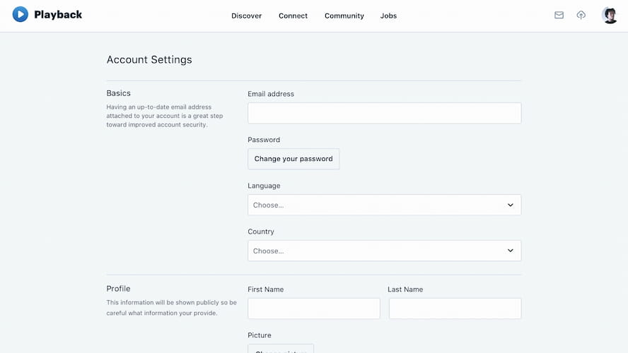
Designing a complex form interface
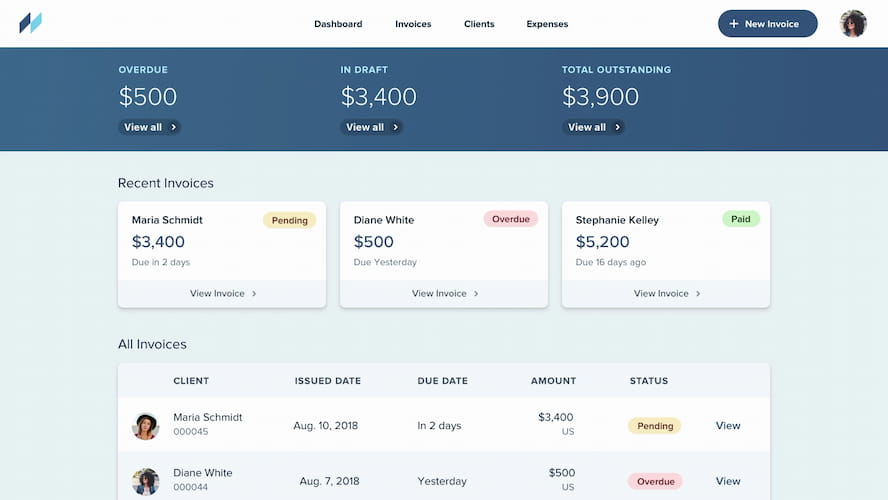
Building a data-focused dashboard
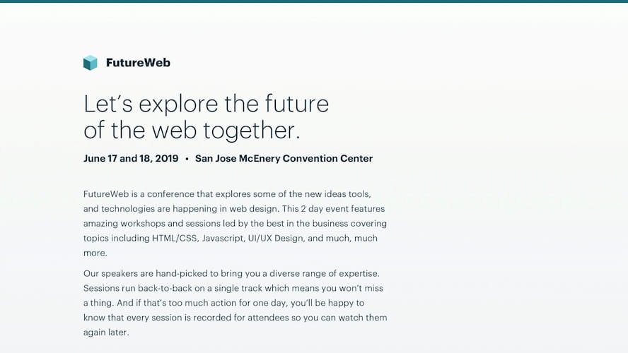
Styling a text-focused landing page
Each video is tightly edited and just the right pace, so there’s no wasted time watching me “hmm” and “uhh” my way around the design.
The Component Gallery
How many times have you found yourself looking at other apps to get ideas for things like button styles, form layouts, or navigation treatments?
This has always been a huge pain point for us with our own work, so we built the component gallery to solve it.
The component gallery is a huge resource of 20+ component/layout categories, and 200+ individual component styles.
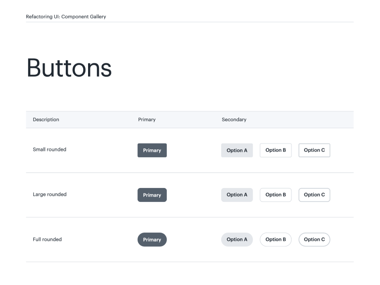
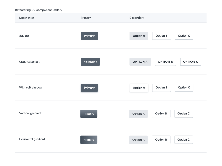
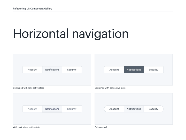
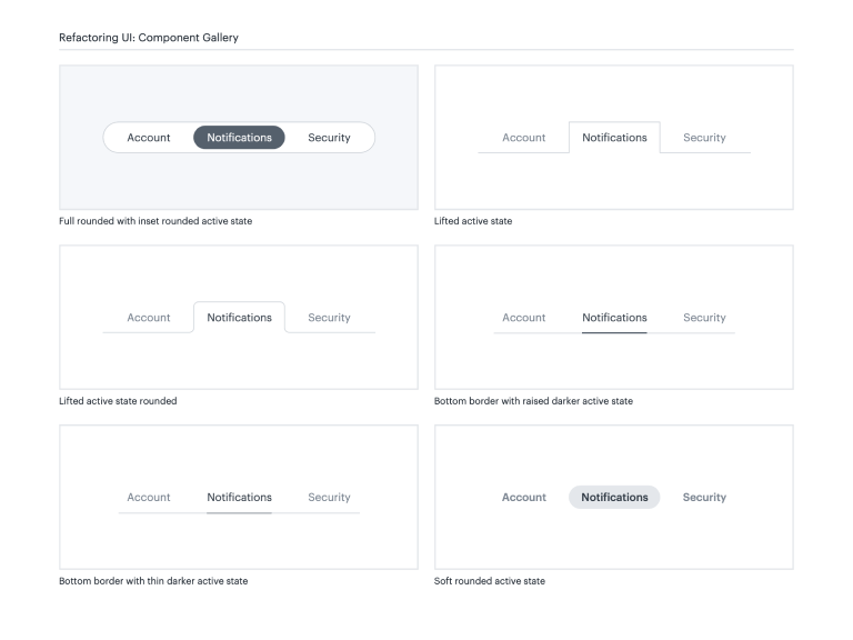
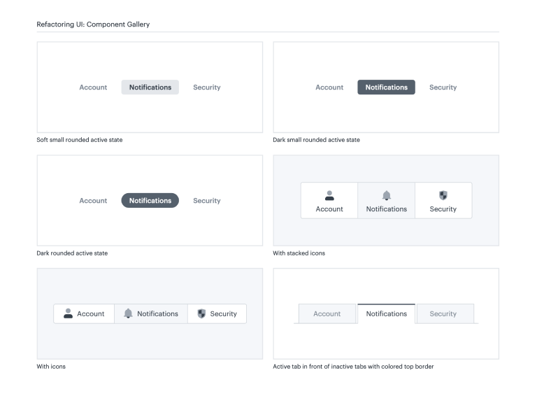
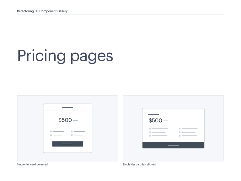
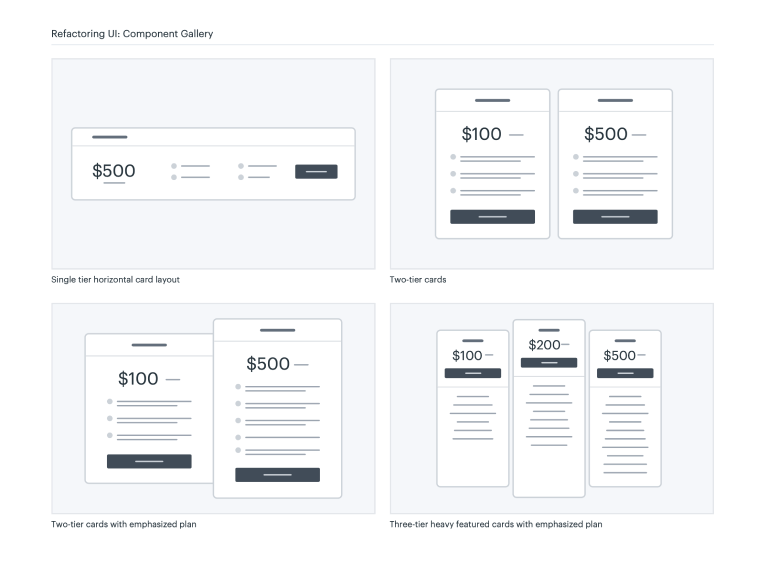
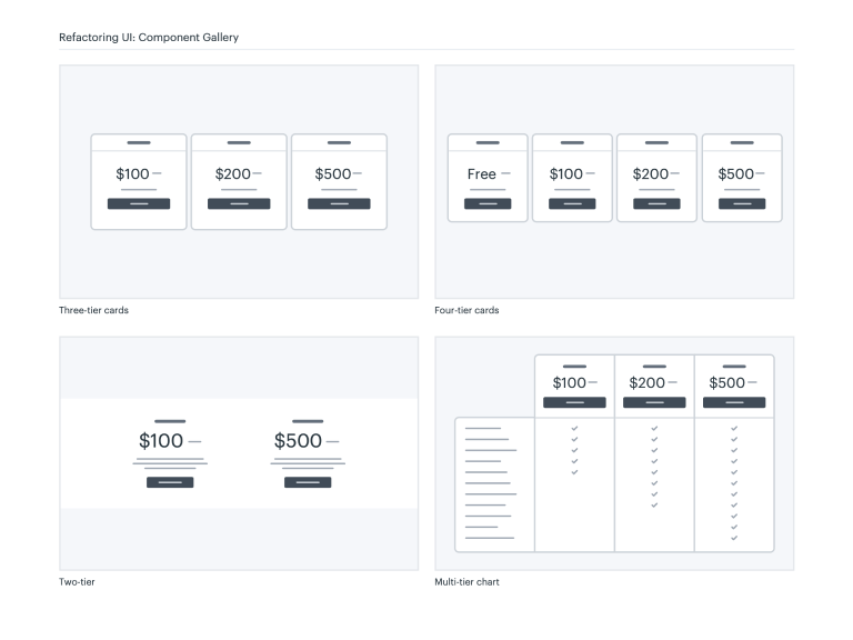
It includes medium-fidelity mockups of every idea we could think of, for every component we could think of, including things like:
- Button styles
- Card layouts
- Login page layouts
- Table styles
- Marketing page sections
- Navigation layouts
…and much, much more.
Color Palettes
If you’ve ever used an online color palette generator, you know that the five swatches they end up giving you are never enough to build out a real interface.
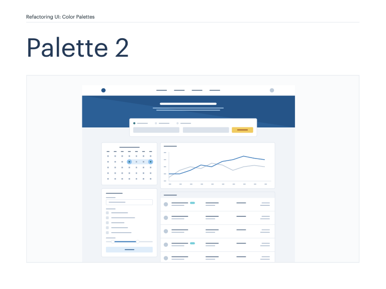
We set out to solve this by handcrafting over a dozen comprehensive color palettes that include 10 shades for each included color, as well as an example UI showing how those colors are intended to be used:
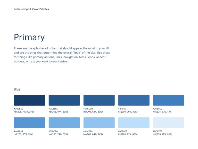
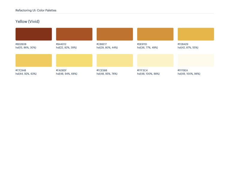
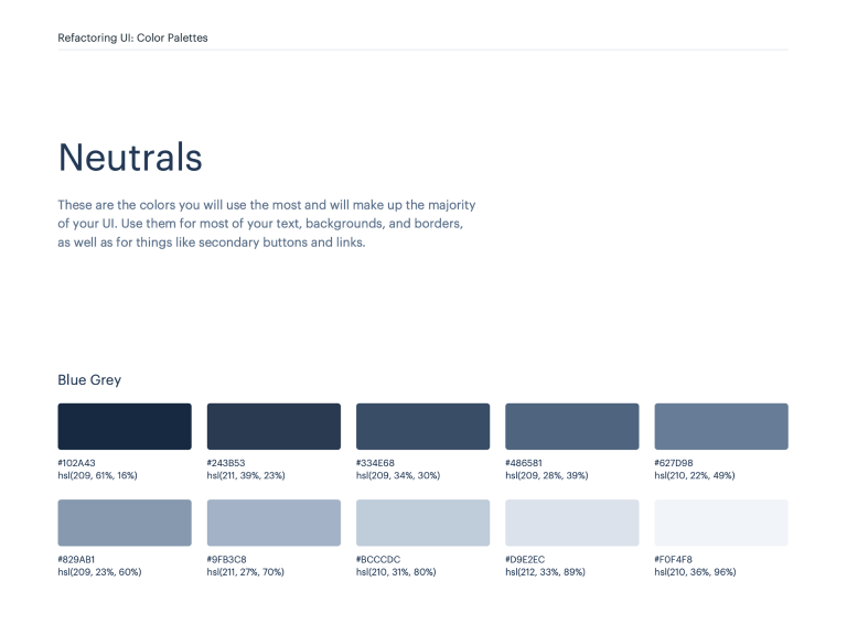
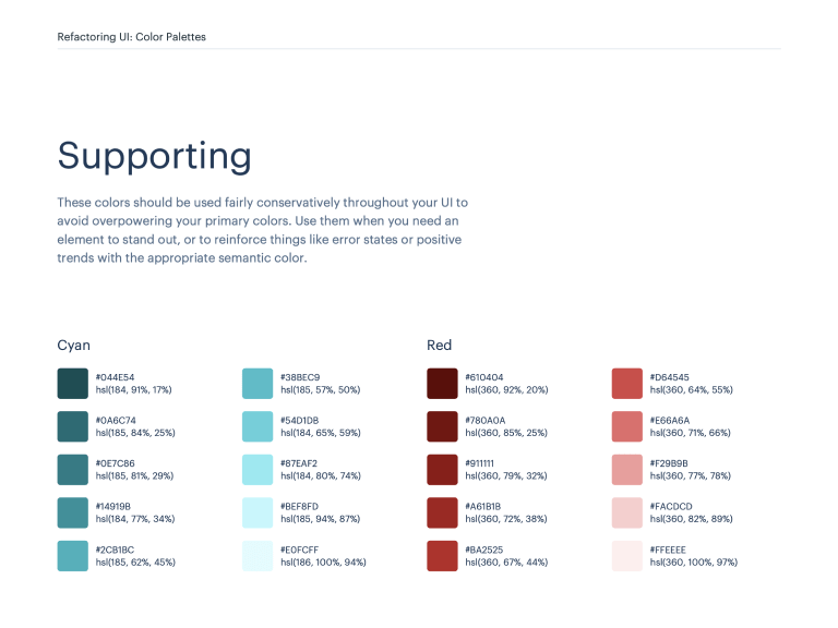
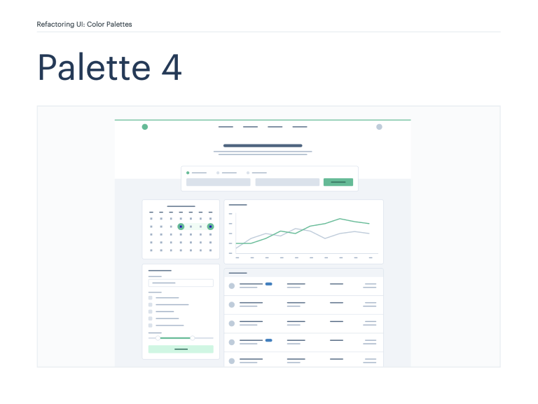
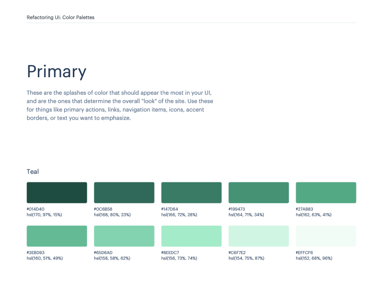
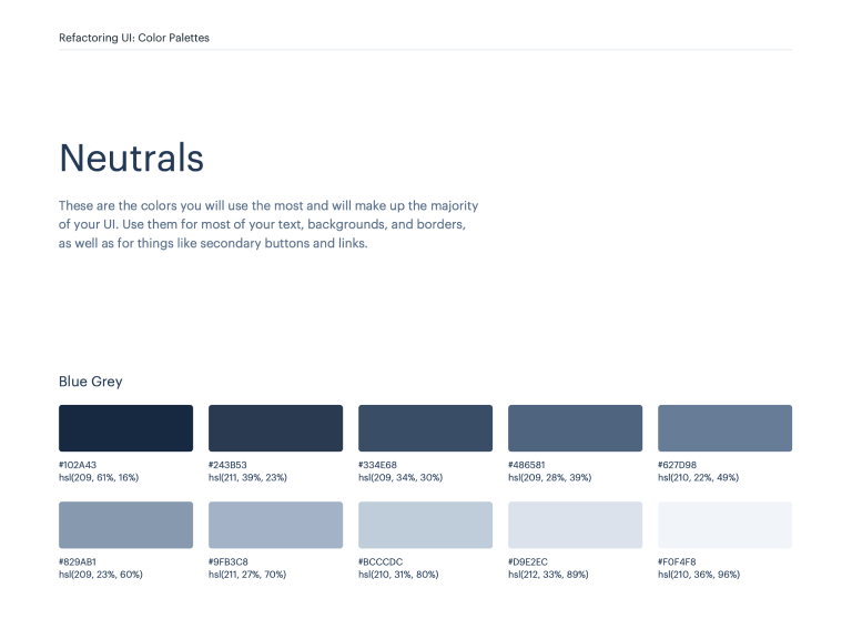
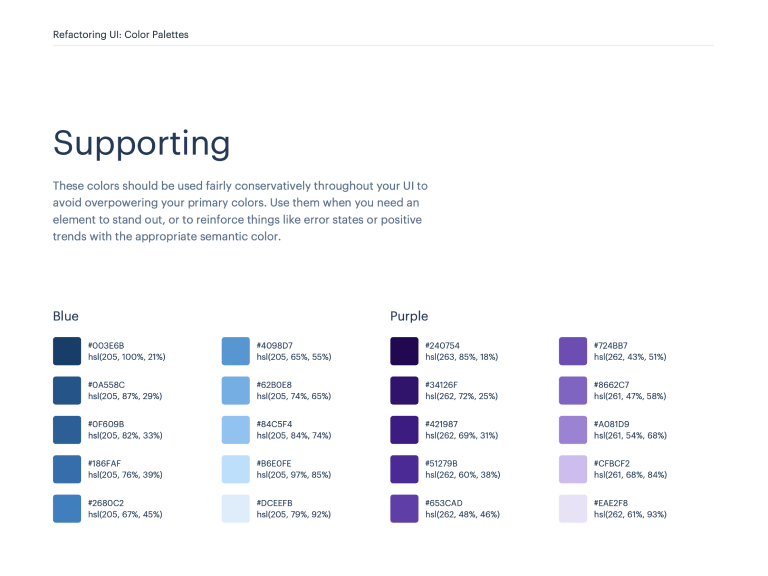
We’ve also put together a huge library of individual color scales that you can use to curate your own palettes, without handpicking every single shade yourself.
Font Suggestions
Trying to pick the perfect font for a project is a nightmare. There are thousands of fonts to choose from, and trying to make an informed decision without seeing a particular font in the right context takes forever.
We’ve put together a list of over 30 fonts we absolutely love, and broken it down across three categories: UI, headlines, and article copy.
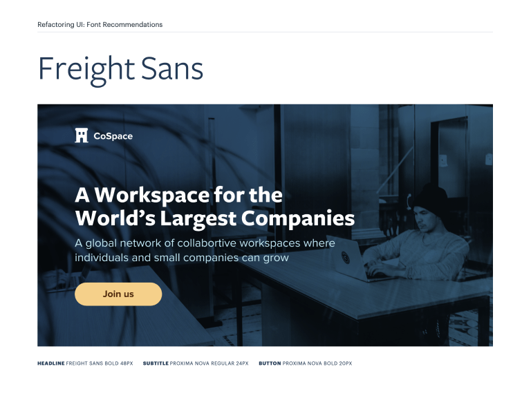

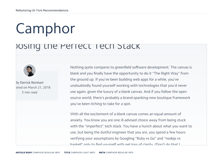
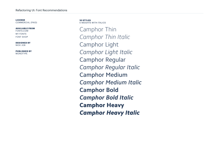
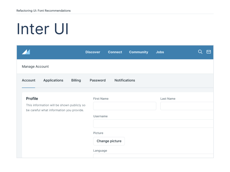
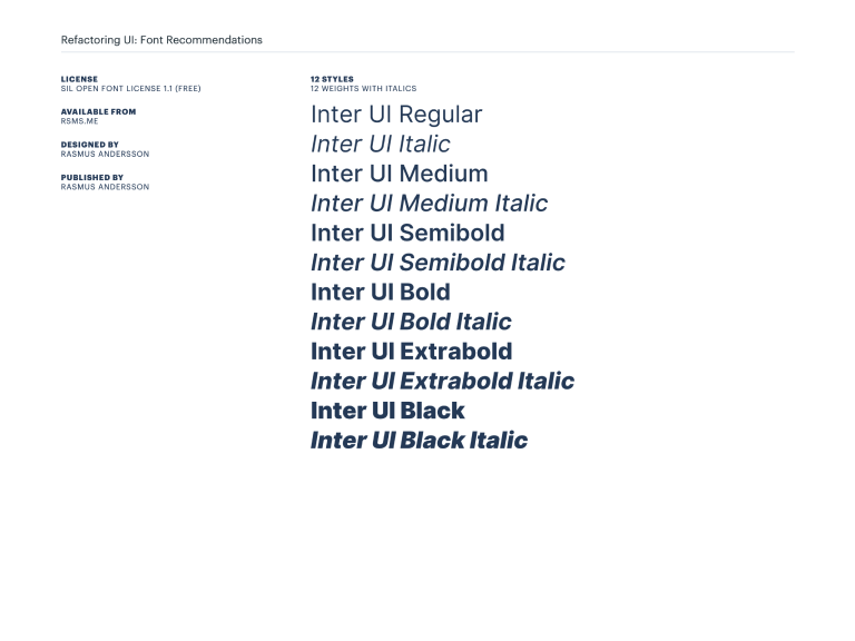
Each font is shown in an example UI for that category, so you can get a feel for exactly how it’s going to look where you intend to use it, without having to try each font yourself.
If you’ve ever felt uneasy trying to choose a typeface, this is going to save you a ton of time.
Custom illustrated icons
Refactoring UI also includes a set of 200 beautifully illustrated SVG icons.
The SVGs are pre-optimized, and the colors can easily be customized to fit your branding with just CSS — no design tool knowledge required.
fill: #637985; }
fill: #0D2B3E; }
Get Refactoring UI today.
Learn how to design beautiful user interfaces by yourself using specific tactics explained from a developer's point-of-view.
The Complete Package
- The 218-page book in PDF format
- All three in-depth video tutorials
- Component inspiration gallery, featuring 200+ component and layout ideas
- Over a dozen comprehensive color palettes, tailored for application UIs
- Curated font showcase, including 30+ font recommendations categorized by use-case
- Exclusive icon library, including 200 easily customizable SVG icons
The Essentials
- The 218-page book in PDF format
- All three in-depth video tutorials
Over 20,000 people are already using Refactoring UI to make their ideas look awesome.
Here’s what some of them are saying…
People ask me all the time where to learn to become a better designer. Well, here it is!
 View tweet by Wes BosWes Bos@wesbos
We just bought this at work and I absolutely love it. You guys did a great job. I do a lot of UI work but did it based on "feel" but couldn't explain why... your book does exactly that. Great work!
 View tweet by Dana CottreauDana Cottreau@_DanaCottreau
Well I just read Refactoring UI by @adamwathan and @steveschoger in one sitting. So it’s safe to say it’s a great book 🔥
 View tweet by TashTash@_tashhockey
I can proudly say that this is the best purchase I have made in a long time. Maybe ever! I love how visual it is -- forcing my wife to read it next! 😂
 View tweet by Chris BreuerChris Breuer@chrisbreuer1904
Wow. What a read. This book has the most approachable, actionable, and useful design advice that I've ever seen 👏👏👏 @steveschoger and @adamwathan deserve a massive round of applause for putting this together
 View tweet by Nick BasileNick Basile@nickjbasile
Frequently asked questions
- Can I get Refactoring UI for my entire team?
Sure! We offer team discounts on the Complete Package based on the number of team members you'd like to purchase for:
- Can I get an invoice?
Totally! After making a purchase we will automatically email you a receipt. That email will include a link to generate a more detailed invoice that can include your company information, should you need that for tax purposes.
- What format are the files? Is there any DRM?
The book, component gallery, color palettes, and font recommendations are PDFs, the screencasts are downloadable mp4 files, and the icons are SVG.
Everything is DRM-free; that crap is annoying.
- Can I upgrade to the complete package later?
Of course! Shoot us an email at [email protected] and we'll sort you out.
- Does the component gallery include CSS?
Short answer is no.
Long answer is that the goal with the component gallery is to provide layout and treatment ideas with just enough fidelity to be useful.
If you need an idea for a pricing page layout, the idea is that you'd browse the component gallery to find one you like, then combine that with what you learn from the book to create a great-looking design yourself.
There are a million ways you could style these components, and we don't want the component gallery to encourage you to make every project look the same.
- What's the license for the icons?
You can read a copy of the license here.
TL;DR: Do pretty much whatever you want with them, including using them in open-source projects. Just don't resell them or publish them on npm purely to distribute them for free or anything lame like that.
- What if I decide it's not for me?
No problem at all! Email us at [email protected] within 60 days and we'll refund you in full, no questions asked.
